UDREY

BANDCAMP
Project Overview
Bandcamp is a music streaming service and online record store designed to meet the needs of the independent music community. Unlike many of their more mainstream competitors, Bandcamp’s business model is geared toward not just paying artists, but paying them WELL. Despite this favored approach, Bandcamp is still very much in the shadows when compared to other more mainstream apps.
Their heavy lean toward the independent music scene is certainly a factor in this, but just as much can be blamed on the fact that their app is outdated. Along with the fact that they’ve yet to incorporate many features people would now call standard amongst other music services.
The Problem: To increase Bandcamp's user share, without negatively affecting the unique artist-first, independent leaning culture of their platform.
The solution: Focusing on the homepage, site navigation, and adding more mainstream features such as playlists, dark mode, and music recommendations, I designed an app that will not only increase use by existing users, but also bring in new users through social media and community recommendations.
Role
Lead UX Researcher
UX Designer
Team | Duration
2 - Week Design Sprint
with 2 Designers
Tools
FIGMA | FigJam
Trello | Toggl | Google Suite
01
Understand & Define
To better understand the company and ensure we were staying connected with their business model, I first started by asking the following question:
“Culturally-speaking, what is Bandcamp?”
Bandcamp essentially started out as an online record store, that over the years has transitioned into not only a streaming service, but also a music community where passionate fans discover, connect with, and directly support the artists they love. Bandcamp stands out with their “artist first” approach - An average of 82% of the proceeds from all sales go directly to the artist. In short, Bandcamp was built to connect artists directly to their fans & make it easy for fans to support artists equitably so that they can keep making music.

Bandcamp's Share
Artist/Label Share
Processing Fees
Despite this favored approach, Bandcamp is still very much in the shadows, when compared to other more mainstream apps. So the real question that begged to be answered was -
"How do we increase Bandcamps’s user share, without negatively affecting the unique artist-first, independent culture of their platform?"
To get a feeling of where we needed to start with our questions, I read several peer review articles, and sorted through hundreds of comments (both good and bad) from bandcamp users, followed by an analysis of the last year of product reviews. I've included a few example of the most common complaints below, along with a pretty accurate drawing from a current bandcamp user, which summarizes the remainder of the reviews. Of course, there were some good comments as well - there is certainly no doubt that people love Bandcamp’s journalism-heavy culture and the unique music that the app so proudly features.


02
Research & Analysis
Competitive Analysis
Next came the research phase, starting with competitive analysis. Through the competitive analysis, I gained a bit of perspective on how truly different the bandcamp app was when compared to other services. What I found was that, while bandcamp’s app leaves much to be desired, they were actually hiding some very unique qualities within their company that others didn’t offer. Some of those hidden gems included things like:
-
Records, cassettes, t-shirts and other merchandise purchase options
-
More in-depth bio on bands and artists
-
Fan pages
-
An impressive online platform for music journalism
Interviews/Surveys/Affinity Mapping
After consolidating the competitive research findings - I moved on to user interviews, while my teammates worked on surveys. The main questions I now knew I needed to focus on answering were:
-
Who is the bandcamp user, and how do we expand their chosen platform without losing them?
-
Who is the spotify/apple music user and how do we expand Bandcamp to welcome them in too?
-
Lastly, for both users, do we need a new feature, or do we need to improve an existing feature?
I completed 4 of our 6 user interviews, and started to combine the answers into an affinity map. Through user interviews we were able to confirm the previous review-analysis findings, and further get into the “why” behind the users needs. Behind the why, I found that for the current bandcamp user, I need to focus on improving existing features and updating the general usability of the app. A few of the specific observations included:
-
The current flow of the app, in general, was not user friendly.
-
Users didn't have a good way of finding music recommendations.
-
Users had no clear way of organizing their music library after purchasing music.
-
They also lack options for customization that are mostly standard in other streaming apps.
-
Many users enjoyed the journalism aspect of music, and although this feature exists on bandcamp’s website, it was missing completely from their mobile app.
Through non-bandcamp user interviews we also found that most general music users relied heavily on friends and social media to stay updated on music recommendations. This became our goal to attract new users - by allowing current users to create a curated playlist and share the playlist - many more people will be made aware of bandcamp. Combined with the improved flow, organization, and customizable features mentioned above - new users would be more apt to stick around and find out what else bandcamp has to offer.
03
Ideate, Sketch, & Design
BEFORE
(ORIGINAL BANDCAMP APP)
-
Current flow is not intuitive. Tabs on home page are not easily recognized.
-
Home page "New/Notable" is too large. Not easily scannable.
-
Music feed is also too large. Time consuming scanning for new music. Only one suggestion full length of page.


-
1/3 of existing users were unsure of purpose for message tab. 2/3 did not use the feature at all.
-
All music listed as long list under <3 icon, with no options for categories, filters, or playlists. Limited sort feature offers recently played or A-Z order.
-
Only able to share a single song at a time.
Mid Fidelity Sketches
Round 3 of sketches after discussions / additional ideation sessions with my team.

High Fidelity Designs
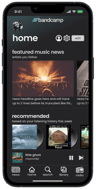
Below I have notated the key touchpoints and changes made within the new application
-
Dark mode has been added in this iteration.
-
Home page sections are able to be customized and re-ordered to the users preferences, by simply clicking "edit" from the top right of the home screen. For instance, if a user did not wish to see music news featured at the top, this section could be moved further down or completely removed from the home page feed.
-
New flow is intuitive and mimics the flow of several streaming apps that users are already familiar with.
-
Home page "new", "top charts", "recommended" and other suggested music is more appropriately sized for viewing multiple options at once.
-
Different categories are organized in rows so users can quickly and efficiently skim through new music offerings.


Additional Considerations
-
The library now features sections, which are customizable much like the home page, giving users more control over the organization of their music.
-
In addition to the standard search feature where users typically search for new songs, A library search feature has been added to allow users to just as easily located a specific song from within their own music.
-
Playlists and sharing capabilities have been added.
-
A tablet version has also been added. Previously, bandcamp's tablet application was just a small mobile window in the middle of user's large tablet screens.


Screens made available for both mobile and tablet, based research findings. Users expressed that they were frustrated by Bandcamp's lack of a tablet interface.


